-
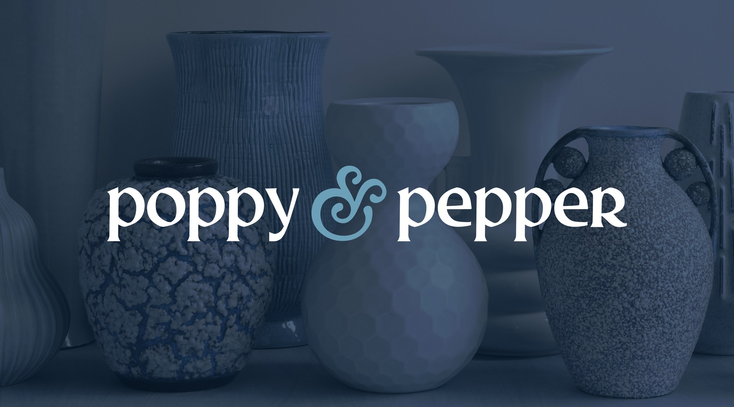
POPPY & PEPPER
-
Brand Identity | Photography | Stationery | Digital Assets | Catalogue
-
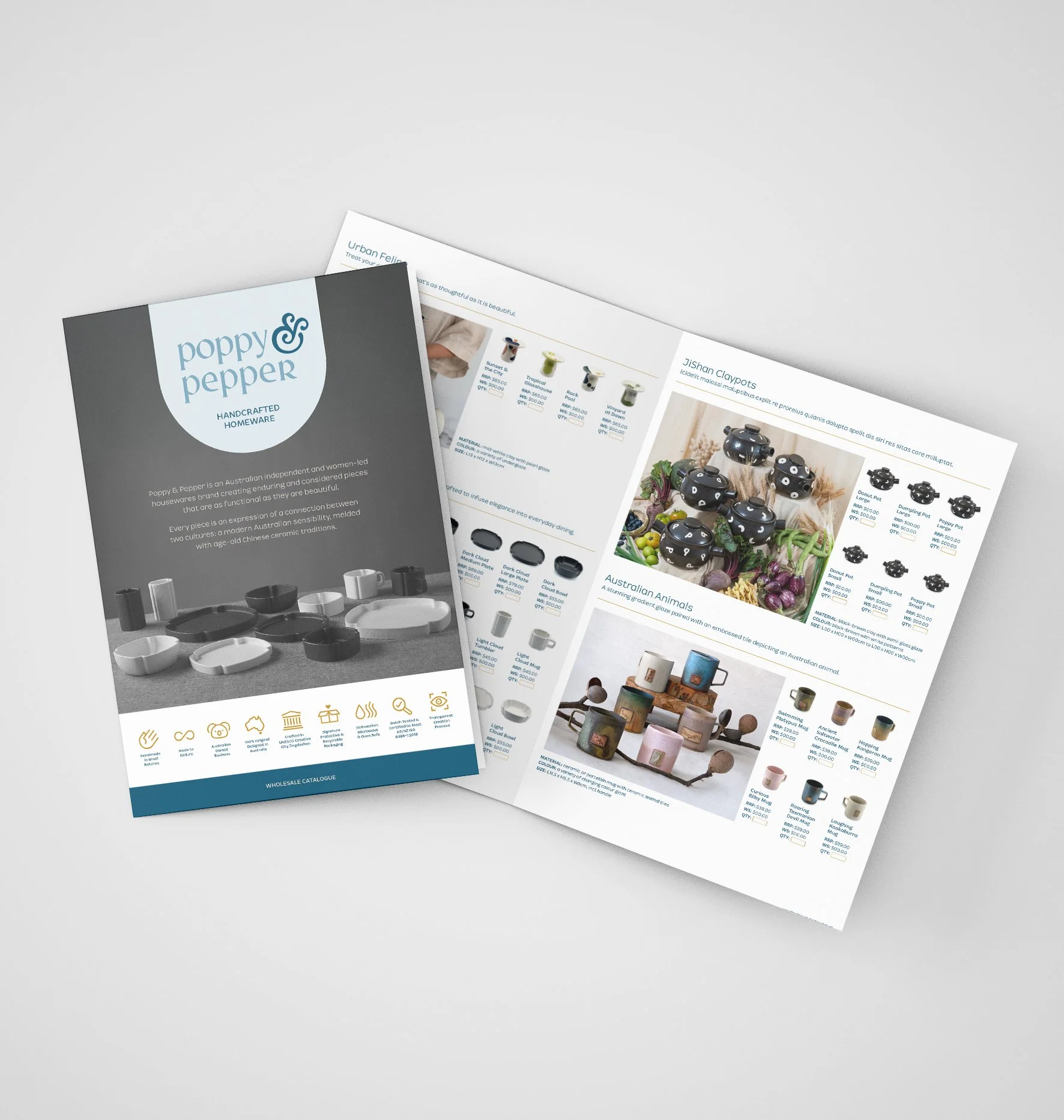
Poppy & Pepper is a product-based brand, strongly influenced by its Chinese heritage. The brand’s homeware range resonates modernised traditional Chinese design and craftsmanship, yet meets today’s Australian aesthetics.
The font style chosen for the logo is modern and clean yet is quirky with its slightly misshapen letterforms. These imperfections add a playful personality and represent handmade craftsmanship. The ampersand ‘&’ is soft, rounded and ornate – mimicking the style of traditional Chinese painted design, and contrasting the angular letters in the logo.
A custom-drawn seamless pattern marries two styles (the organic and ornate with the geometric) to represent both the “old and new”. These differing styles offer balance, resulting in a design that is gender-neutral with both soft and strong shapes. The pattern compliments the logo in form, style and weight.
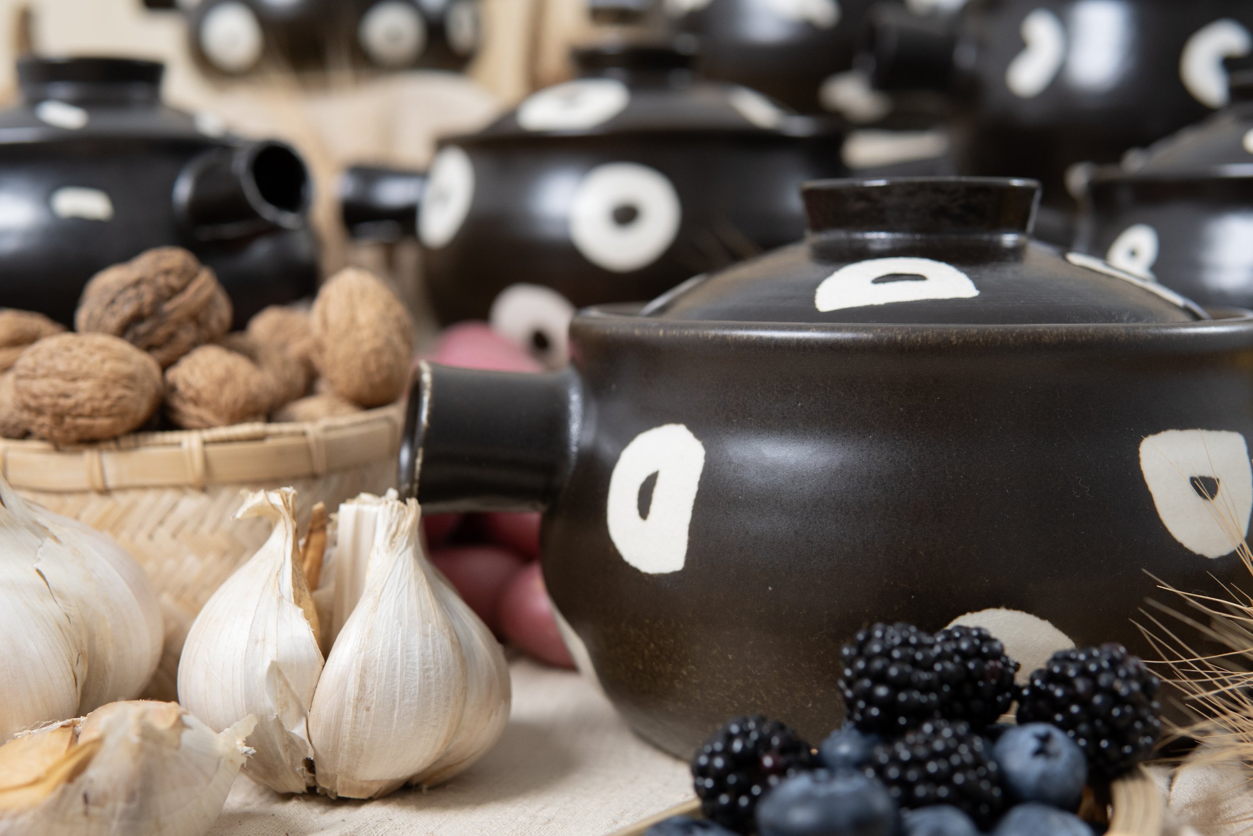
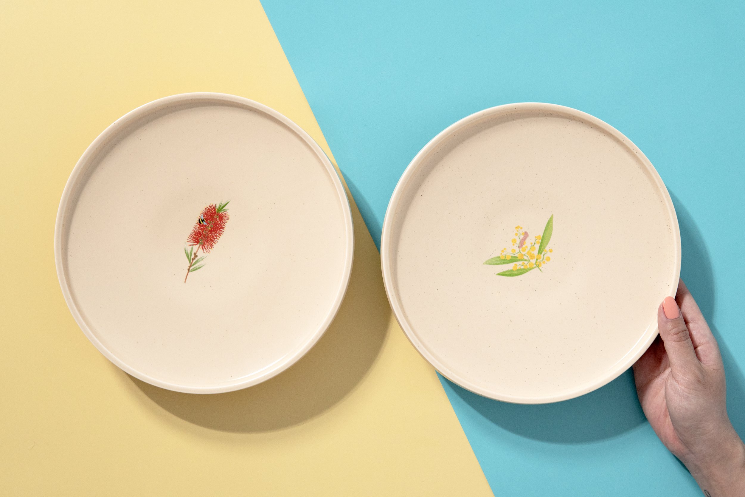
We’ve also partnered with Poppy & Pepper on a series of photoshoots, each carefully styled to highlight the unique character of their different collections. From sun-drenched minimalism to cozy, layered richness, every session was tailored to bring out the distinctive mood, texture, and lifestyle appeal of the products.