-
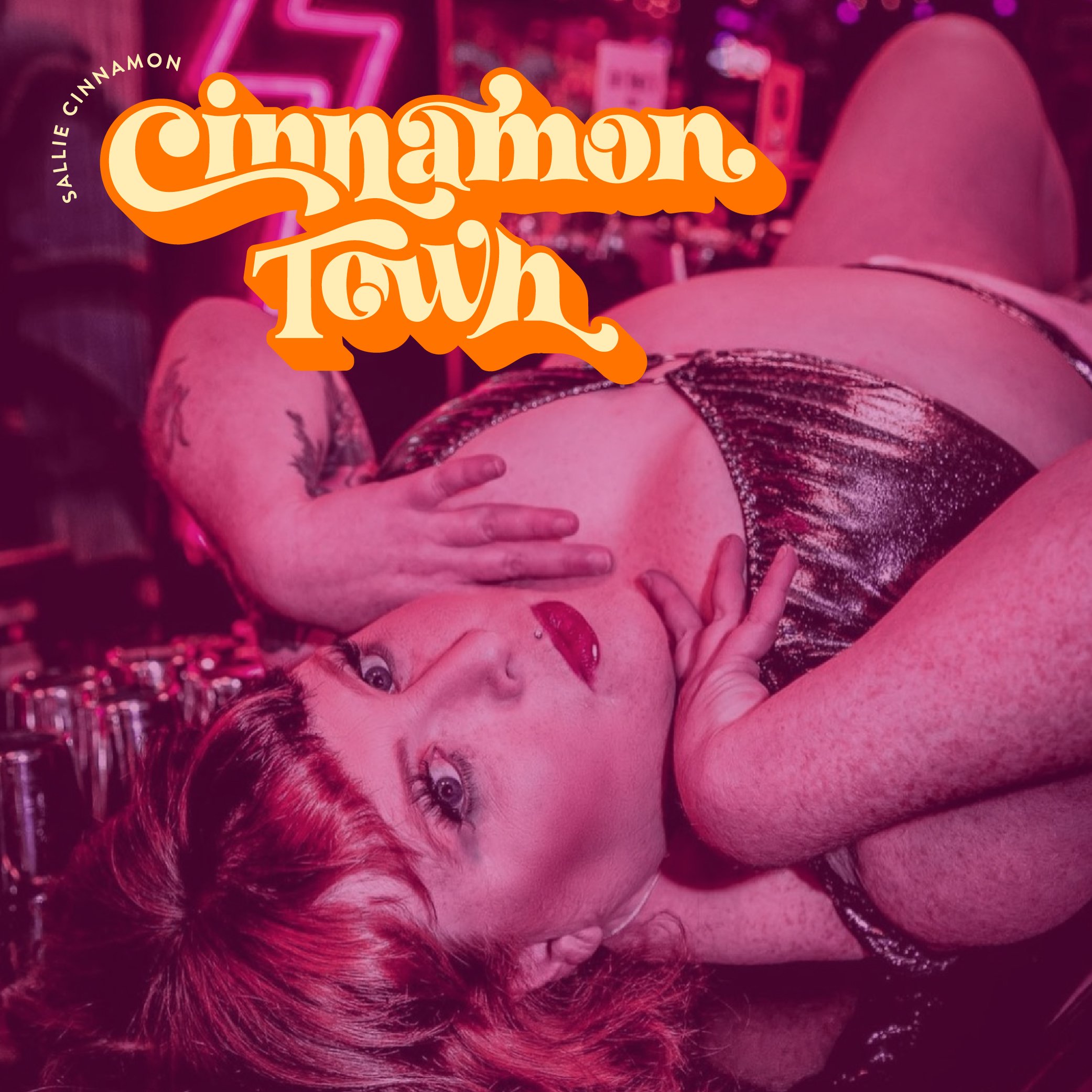
CINNAMON TOWN / SALLIE CINNAMON
-
Brand Identity | Merch | Social Media
-
Sallie Cinnamon provides entertainment through storytelling, character and stage presence.
Sallie’s ‘Cinnamon Town’ concept required a wordmark that captures her sense of camp and silliness yet also ties in some 1960s elements.
The letter style chosen is bold, fun and quirky. Dramatic swashes add a playful and expressive personality and give movement within the lockup. Tight letter spacing and a thick drop shadow offer dimension – together with bulbous characters and vibrant colours, this wordmark carries strong retro vibes.